Abstract Expressionism and Freedom
(Conversation between Victoria Chapman and Los Angeles based artist, Shane Guffogg continues
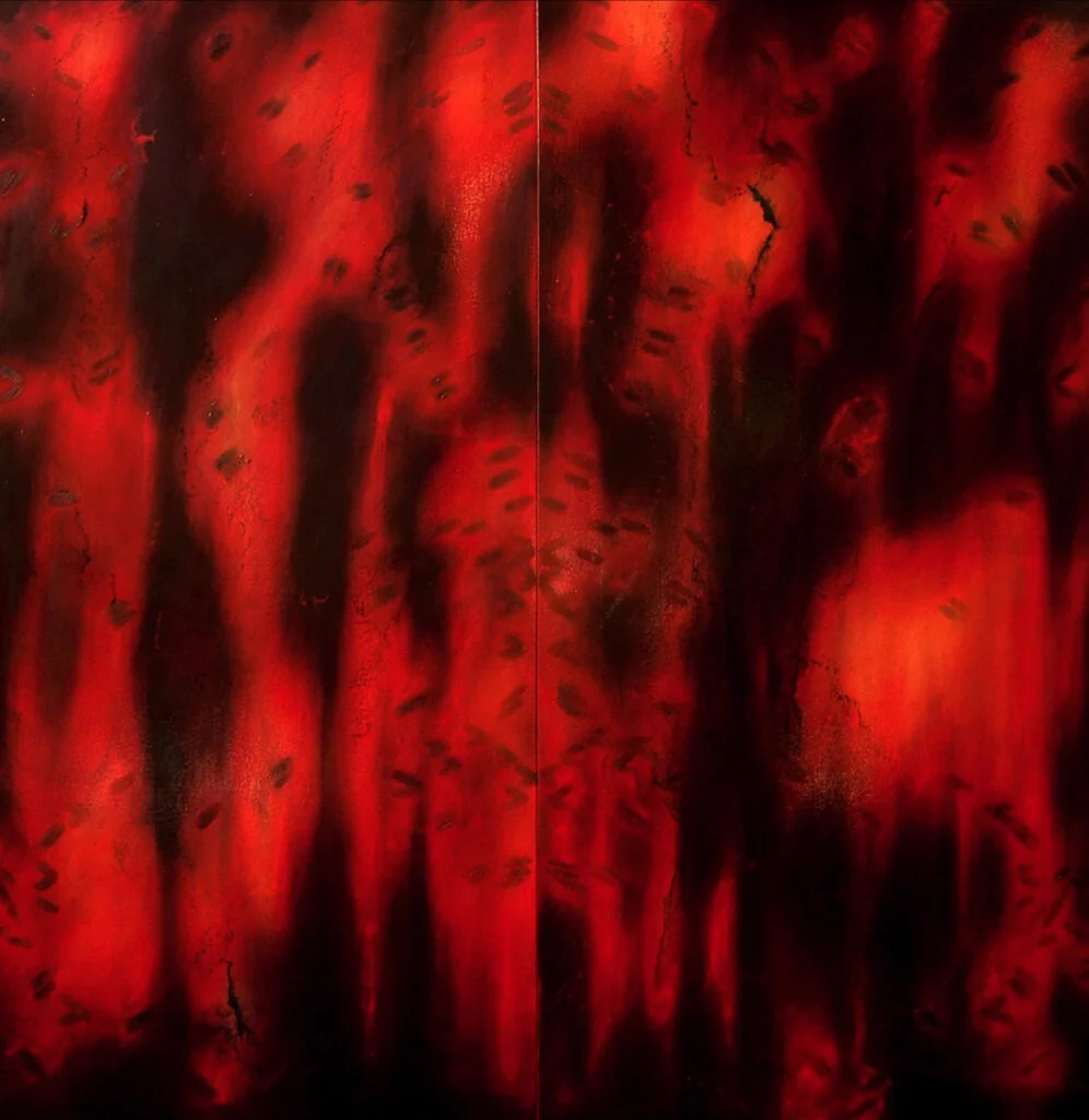
Shane Guffogg, Untitled #84, oil on canvas, 72 x 72″ 1993
Shane Guffogg: Color Part 5
VC: We finished Part 4 entering the uncharted waters of Abstract Expressionism, a movement that incorporated beauty and violence. I was awestruck with the opening monologue of Emile De Antonio’s art documentary film; Painter’s Painting – The New York Art Scene 1940 -1970
The monologue begins …
“They say the problem of American painting is there was a problem of subject matter. Painting in America kept getting tangled up in the contradictions of itself. We made portraits of ourselves when we had no idea who we were. We tried to find God in landscapes, and we were destroying them as fast as we could paint them. We painted Indians as fast as we could kill them. And during the greatest accomplishments in technological history, we painted ourselves as a bunch of fiddling rustics. By the time we became social realists we knew that American themes were not going to lead to a great national art. Only because the themes themselves were hopelessly absolute. Against the consistent attack of Mondrian and Picasso, we had only art of half-truths lacking conviction. The best artists began to yield rather than kick against the pricks. And it is exactly at this moment, we finally abandon the hopeless constraints to create a national art, that we succeeded for the first time to do just that. By resolving a problem forced on a painting by the history of French art. We created for the first time a genuine art of magnitude. And if one had to ask what made American art great, it was American painters who took hold of the issue of abstract art – a freedom that could get with no other subject matter and finally we made high art out of it.”
Newman proclaimed Onement I, 1948
to be his artistic breakthrough
Barnett Neuman contemplating his work in his New York studio
VC: In this film, Barnett Newman (1905-1970) painting, Onement (1948) resembled a solid colored painting with a stripe down the middle of the canvas, which the artist referred to as a ‘zip’, saying “It was a flicker of light.” Never did Newman think of it as a stripe. The artist went on to explain how he sat in his studio for months on end, starring at the painting, contemplating his efforts, and getting rid of atmosphere. In his own words, he said, “his zip united the painting, creating ‘a totality’ – the beginning and the end at once, a dance of elements of forms.”
Willem de Kooning (1904-1997), who was formerly trained in the Masters’ tradition, during this time began to move in and out of color. Jackson Pollock’s (1912-1956) action paintings really helped change the laws of painting. The Abstract Expressionists had a new vision; the painters of the time made these paintings mostly for themselves, and few people came to their exhibitions. Having the hindsight now, they were, in my mind, extremely courageous.
ackson Pollock eventually said, “The strangeness will wear off and I think we will discover the deeper meaning in modern art.” In Clement Greenberg’s (1909-1994) essay Modernist Painting, he wrote, “It was a freeing of individual liberties.” This new American Art Form even got the attention of the CIA, who secretly began financing the touring of exhibitions as a political statement. The originality of this art was a by-product of democracy and represented freedom, and they declared it as a portrait of the American people, in contrast to the art of Russia and China, which consisted of social realism dictated by the communist regime.
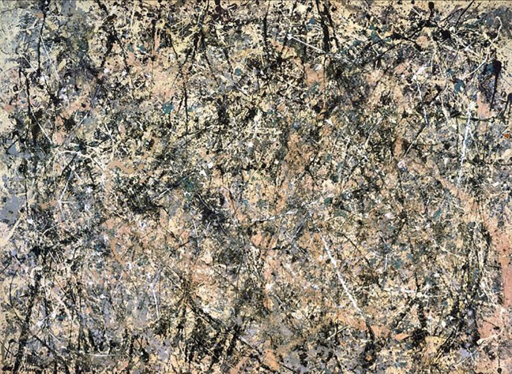
Shane Guffogg: The influence of these two giants (Mondrian and Picasso) was felt in America and it was very hard for American artists to break free of the gravitational pull of Europe. Pollock was considered the first to really do so with his drip paintings. But, I have always thought of those works as an extension of the Surrealist movement and the automatic writing concept of Andre Breton, because Pollock was literally writing with paint in the air using a stick or spatula to sling the paint around. For the most part, Pollock used a very monochromatic palette – lots of greys, black, white, and brown. I can only assume this was happening because he and his wife had moved to Long Island to live in a more rural surroundings. His colors are like the east coast winter colors of nature – the leaves fall and snow blankets the ground, exposing the branches as black, abstract lines that are enveloped in a perpetual winter grey sky. Pollock did have, on occasion, some splashes of primary colors, most notably, the monumental painting titled Blue Poles.
Jackson Pollock, Number 1,1950, (Lavender Mist)
oil enamel and aluminum paint on canvas, 87 x 118″
Jackson Pollock, Blue Poles
oil, enamel, aluminum paint, glass, on canvas
83.4 x 192.4″, 1952
VC: I read that in 1950 Pollock was working on a small painting on his easel and was frustrated and somehow got the idea to take it to the ground to continue. From that moment, he discovered a new way to work. Pollock spent the next five years exploring this process. I read that he used alkyd, enamel, and car paints that were fluid. The paint, along with his techniques, created worlds within worlds. Most of the paintings were monochromatic with satellites of brighter colors peering through. These paintings weren’t about composition but to me resemble a tracing of something else. I can imagine Pollock moving across the floor focused on creating the painting, but also listening to his inner voice, with hand to brush, selecting a color to emotion, conducting in his mind, and writing with paint a sort of musical score. This could and would become Action Painting, that no doubt was his sacred dance. But is this abstract painting?
Shane Guffogg: I think all painting is abstract, but more to the point, giving the paint the illusionary power to trick us into believing we are seeing something we recognize is abstract. Allowing paint to be about itself is realism, in my opinion. But, that being said, I think Pollock was a realist and made paintings inspired by nature. He was exploring an idea and I think that idea was the artist as a shaman. By that I mean, through his process, he was bringing forth the energies that give rise to the life we see all around us.
VC: That’s heavy, and I am very much inspired by what you said. But before I get sidetracked, let me ask you about Clement Greenberg, who rejected Pollock and his work.
Shane Guffogg: At first Greenberg championed Pollock, and it was he who suggested him for the Life Magazine article, which catapulted Pollock into the eyes of the world. But, Greenberg was after a purist idea of painting that was about completely destroying the illusion of space. Pollock was the one who broke free of European influences and Greenberg cheered him on but then started to tell him what his next step could or should be. Greenberg felt that Pollock hadn’t completely broken free because the lines in his paintings that crossed over each other created a visual space, thus still keeping it tied to early art. Greenberg wanted complete flatness, and Clifford Stills was the next artist he championed.
Life Magazine, August 8, 1949 “In the Art World” Jackson Pollock
Clement Greenberg, ‘Masterly Art Critic’ Vogue, March 1, 1969
VC: It’s surprising for me to think that Greenberg as an essayist had enough power to usher artists to create art the way he thought should be fit. Personally, I am glad there was a rebellion. But maybe artists need this push? I thought “new waves” happened organically or with a sort of global synergy. What do you think about art critics or an essay getting in the middle of the artist and their work? Do you think Rothko’s statements in color were a purist act on his part or do you think he was influenced?
Shane Guffogg: Up until the late 1960s, artists and art writers were two different camps of people. Painting was a visceral act throughout history, that is until the pop art movement hit. That work took on a different approach to art-making — more mechanical — and was followed by another rebellion of young artists who thought pop art was all about capitalism. They reacted by making art that couldn’t be bought and sold. This was done via installations, like a drawing on a gallery wall that would be destroyed after the exhibition was finished. But the art world engineers decided to have statements from these artists that the artist would sign, and that little signed piece of paper was the art or at least the idea behind it. A lot of these artists had to find a way to make a living since they weren’t making art that could be sold. Hence, the bridge between the artist as maker and the artist as an intellectual writer was born. And these new artists got jobs as art critics or teaching in schools like CalArts where they promoted their ideas of anti-capitalist (one might even say Marxist) art, which ushered in the demise of painting as a visceral form of communication. I went to CalArts in the heyday of this new anti-painting era, but it only made me want to paint that much more. And in so doing, I really started looking at the great painters throughout history as teachers for me to learn from.
As for Rothko, I think he was part of a lineage of painters and his work was a natural progression. If you look at Turner and Bonnard and then Rothko, we see how Rothko took out the imagery but kept the colors and light. The colors of Bonnard’s work are like fragments of memory, flickering on the surface of an imaginary world. Rothko’s work does a similar dance with the human psyche.
J.M.W.Turner, Flint Castle
watercolor on paper, 1838
Mark Rothko, Orange and Yellow
oil painting, 90 x 70″, 1956
Pierre Bonnard, Nude in a Bath
oil paint on canvas, 36.6 x 57.8″, 1936-8
VC: Alberto Giacometti’s paintings of time also displayed a lack of color. I saw a film at the Tate Modern accompanying his retrospective which revealed his process. The film was in black and white and the camera was propped up in the room documenting the process. The studio was small and cramped and monochromatic in color. It was filled with his art in a variety of stages. Giacometti was standing staring at the model, with so much intent feverishly drawing, and in some moments, I felt he had anger, rage, or even grief. The film was very intense, and all the while the model was patiently sitting in a chair. These painting sessions seemed to last hours. Giacometti chiseled away at his paintings much like he did his sculptures. The portraits began in pencil. And then paint; where the artist maintained consistency of building and destroying. His color palette was a variation of light and dark colors. These works were about the fragility and fractured state of humanity crippled by the effects of war. Was Giacometti a tortured soul or did he chose to document the human condition around him? I read, each day, he was obliged to start his career completely over, refusing to rely on past achievements. From my point of view, I think his work exercises a sort of empathy toward humanity.
Shane Guffogg: Yes, he did change the way we see. The war had a huge impact on him and, if you think about what the color of bombed buildings is, we see the palette of Giacometti. His portraits are some of my favorites, with the lines being built up over and over as if his mind is tracing his own memories of what he is seeing. Really extraordinary works.
Giacometti’s work taught us a new way to see.
These works were about the fragility and fractured state of humanity
crippled by the effects of war.
Giacometti’s work taught us a new way to see.
These works were about the fragility and fractured state of humanity
crippled by the effects of war.
VC: Giacometti reminded us how we should view a portrait from the inside out by feeling and not only by seeing. His color palette may have helped us get there. Taking into consideration, we had begun viewing art at the Lascaux caves, which told a story. Medieval art was about learning codes and rules. Renaissance art brought up the idea that there was more to question, onward to the 19th and 20th-century art of today. Understanding all that, how did we translate Venus of Willendorf to Willem De Kooning’s Woman? How did we get from A to B? And how did De Kooning achieve this via his color palette and style of painting?
Shane Guffogg: De Kooning was following the European tradition of painting the female form that functioned as something to be revered. He became an abstract painter who left NY for Long Island and was peers with Pollock. De Kooning grew up in Holland and was trained in the old Masters techniques, which can be a plus or minus, depending on where you want to take the painting. I see de Kooning as a fusion of Picasso and Matisse. His Woman series was heavily influenced by Picasso’s synthetic cubist style. A prime example is the painting from 1952. The face and outlines of the body are drawn with charcoal, similar-to Picasso’s use of black outlines in the woman before a mirror, but de Kooning’s choice of colors are more subdued, like colors we see in nature. The greens and blues are soft, the reds and yellows are accents to the white and black. His use of color is not so much about color, but the way he applied it, which was about the action of painting, hence the term Abstract Expressionism, aka action Painting. But in his later works, we see him follow the lessons of Matisse and remove the images, focusing on the purity of color, which was usually primary, and his act of painting; the painting becoming documentation of that moment. The movements of his brush (which would be loaded with a thinned down paint) across the canvas was a type of calligraphy that also tapped into his subconscious in a very similar way that Pollock did with his drip paintings. We also have to keep in mind that the writings of Freud and then the ideas of the collective unconscious that Jung introduced were playing a big part in art. The mind was an interior landscape and, coming off the heels of WWII, the psychological damage that was done to a generation, not to mention the destruction of cities in different parts of the world, left a fractured landscape that is echoed in Pollock’s drip paintings and de Kooning’s Woman series. By the end of de Kooning’s life, his work seemed to be more harmonious and took on titles that referenced his rural surroundings. Nature was his muse.
Willem de Kooning, Portrait of Boy with Ball
oil, charcoal and Conte crayon on canvas, 1924
Pencil drawing of Elaine de Kooning
by Willem de Kooning, 1940
VC: What you share about Freud’s writings and Jung’s ideas about collective consciousness are so important. De Kooning’s Woman paintings had an additional element which was collage. These elements, cutouts of eyes or a mouth, were symbolic to the vanishing female figure. The figure disappeared and reappeared through a variety of elements including collage. Which was embedded in the fleshy colored paint strokes? De Kooning rightfully said,
“Art doesn’t have to look a certain way.”
When we look at art it’s important to consider history. An artist may contextualize their work in mediums that best describe how they interpret life. What I also think is equally fascinating is Robert Rauschenberg’s attempt to erase one of De Kooning’s Woman drawings.
Did De Kooning’s series inspire any of your work?
Venus of Willendorf is an Upper Paleolithic female figurine
said to be roughly 30,000 years old and was found in 1908 at Willendorf, Austria
Willem de Kooning, Woman 1
painting, 1950 – 1952
Pablo Picasso, Portrait of Dora Maar
oil on canvas, 36 1/5 x 24 3/5″, 1937
VC: Equally important players in the Abstract Expressionist Art movement are Mark Rothko and Clifford Still. When I think of Rothko, I envision something spiritual and emotional. The paintings have been typically large but I don’t believe the scale is what has made them successful. How does his use of color inform the viewer of what to see and feel? I think Clifford Still is in a similar category, would you share your thoughts?
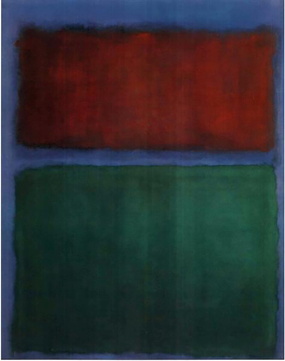
Shane Guffogg: Mark Rothko and Clifford Still are a different story from De Kooning and Pollock. Their paintings are color for colorspace, especially Rothko. I had the great pleasure of seeing a Rothko retrospective in NY in 1998. All the chit-chat news was about the Pollock retrospective at MoMA and the Rothko was almost under the radar at the Whitney. But thankfully I read about it in the then-current art exhibition section of the New Yorker. Rothko’s work is about being human, and by that, I mean the emotions that come through the simple act of living. Rothko’s rectangular bands of pure color create a space for us to enter by submerging the viewer in color, and, in a lot of cases with his work, one or more rectangular shapes will seemingly float in front of the background color, if only by a few inches. For instance, look at the Rothko titled “Light Red Over Black.” The background is a medium cadmium red, and a small light red rectangle is painted at the top, but it’s almost invisible, looking more like an apparition of something on the verge of showing itself. Then the middle rectangle has an underpaint of cobalt blue, which pushes away from the red. But there is a thin wash of charcoal grey painted over the blue, and that area literally lifts off of the red and floats. The bottom rectangle is a lighter, neutral grey that also lifts off of the red. These dark areas reach out towards us, reversing the role of red, which forces it to recede. Now let’s say red represents anger, the dark blue-black represents sadness, and the grey is a melancholy state of mind – we are confronted with a moment of visual reconciliation. Rothko’s work has taken my breath away more than once, needless to say. They are about the conversation that is quietly happening within all of us as we grapple with our emotions while navigating our physical world.
Clifford Still’s work is, in my view, about the landscape. Still painted with a palette knife, spreading the paint over unprimed sections of his canvas, pushing the edges of colors up against one another. His untitled painting (PH119) is a perfect example of what I am talking about. The shades of yellow ochre and cadmium yellow are painted in a way that shows movement as if it is a topographical image of a vast span of land and we are witnessing nature’s handy work. The black areas are like objects, with the sliver of white becoming the last remnants of snow on a mountain top. The red that is painted within the burnt sienna is a hot spot – a fire zone perhaps? Both of these artist’s works are monumental in size and that is for a reason; to capture our senses by being larger than we are and engulfing our field of vision, and thus our senses. There is a distinct difference between the European giants and the American counterparts. The European artists never fully shook off the influence of centuries worth of figurative art. The human form became a vehicle for countless variations of exploration with form and color. The American abstract painters were able to leave the past behind, purifying the use of color, making art for art’s sake. Picasso and Matisse invented a new way for us to see. The American masters created a new way to think.
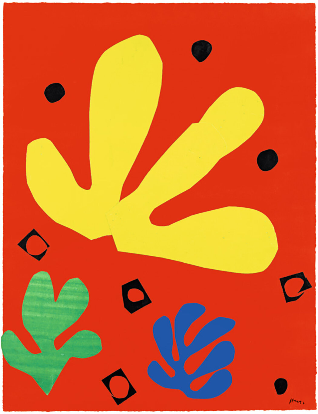
Henri Matisse painted paper Cut-outs. Circa late 1940s
Willem de Kooning, Untitled V
oil on canvas, 88 x 77″, 1993
Clifford Still, PH 119
oil on canvas, 71 x 45“, 1948
VC: Wow. How did these American masters influence or inform your work? Can you give us some examples with specific paintings?
Shane Guffogg: Good question. I can point to specific paintings where I was thinking about certain artists. For instance, Clifford Still and the way he pushed colors against each other was an idea that I explored in a painting from 1993, “Untitled #84.” The blacks are like silhouetted parts of landscapes or objects. I was reading and thinking a lot about Still’s paintings while working on it. Another connection is the “100 Walnuts” painting I did in 1988. As I was saying about how Rothko’s bands of colors seemingly float, that is the idea I was thinking about concerning the walnuts. I wanted them to float above the color field of green. And I gave a little clue to this by painting 4 rectangular bars of a lighter green, ala Rothko.
Other prime examples are the ribbon paintings and their connection to Pollock and automatic writing, like the painting titled “Between Heavens #1” from 2003. This painting is pulling from a number of sources, like Rembrandt, for instance, which is obvious from the burnt sienna and umber colors; the overall movement of the lines is also connected to Pollock. Being a post-post-modernist painter, I feel I have the great luxury to pull from art history any things that are of interest to me and fuse them together to form something new, like the fusion of Trompe-l’œil with the walnuts and abstraction with Rothko. Or the old master techniques of glazing that were perfected by Leonardo and Rembrandt and combining that with paintings like Untitled #11 from 1991, that has swooping lines that hover like an operatic moment, evoking Degas’s opera singers while nodding to de Kooning and his black and white period. I tend not to think of time as linear when it comes to art history because time compresses back into itself becoming a single moment to witness.
Rembrandt, Self-Portrait with Two Circles
oil on canvas, 45 x 37″,1665
(Detail) Shane Guffogg, Between Heavens #1
oil on canvas, 52 x 132″, 2003
(Partial view) Shane Guffogg, Between Heavens #1
oil on canvas, 52 x 132″, 2003
Shane Guffogg, 100 Walnuts
acrylic on canvas, 57 x 57″, 1987
Mark Rothko, Earth Green
oil painting, 31 x 24″, 1955
VC: This explains so much about your work, including the ribbon paintings in relation to automatic writing. It’s incredibly fascinating to learn how an artist may receive information and transmit it. The art and artists that triumphed through Abstract Expressionism found a meaningful voice to change the laws of art. It helped separate European art from American, offering freedom, a mission which the country has always stood by.
The writing of Part 5 essay is particularly unique, as we wrote this in self-quarantine and remained dedicated to our passion no matter what. For me, being in lockdown, not able to work at the studio, see gallery exhibitions, or even visit museums, have made the presence of art all-the-more important. As we all continue to live our lives in temporary isolation, Shane and I will move onward to Part 6, discussing Post Modernism, and artists such as Anselm Kiefer, Gerhardt Richter, Sean Scully and more. Stay tuned.
